data visualization

Seattle's (relatively) cool winter, Part 2

This is Part 2 of a two-part blog post highlighting the cool winter season we’ve generally experience in the Seattle area this year.

  • For both posts, I am using a ‘seasonal year’ which runs from November 1 through the follow October 31.

  • Technically, November is late autumn, but snow is not uncommon in the Seattle area in November, and it is generally the beginning of our long winter-spring season, where on any given day it may seem more wintry or springlike during this period. Low temperatures can typically drop into the 30s ˚F and rarely rise above 60 ˚F, and often barely reaching the 50s ˚F.

  • Days are often cloudy in this period as well in addition to being cool.

  • Part 1 explore the Accumulated Average Daily Temperature.

  • Part 2 explores the Average Daily Temperature by day of the seasonal year for the entire period.


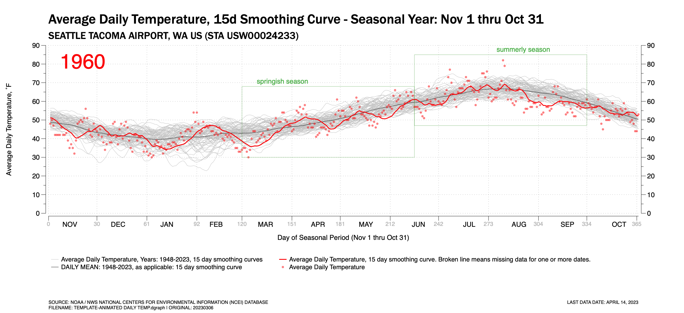
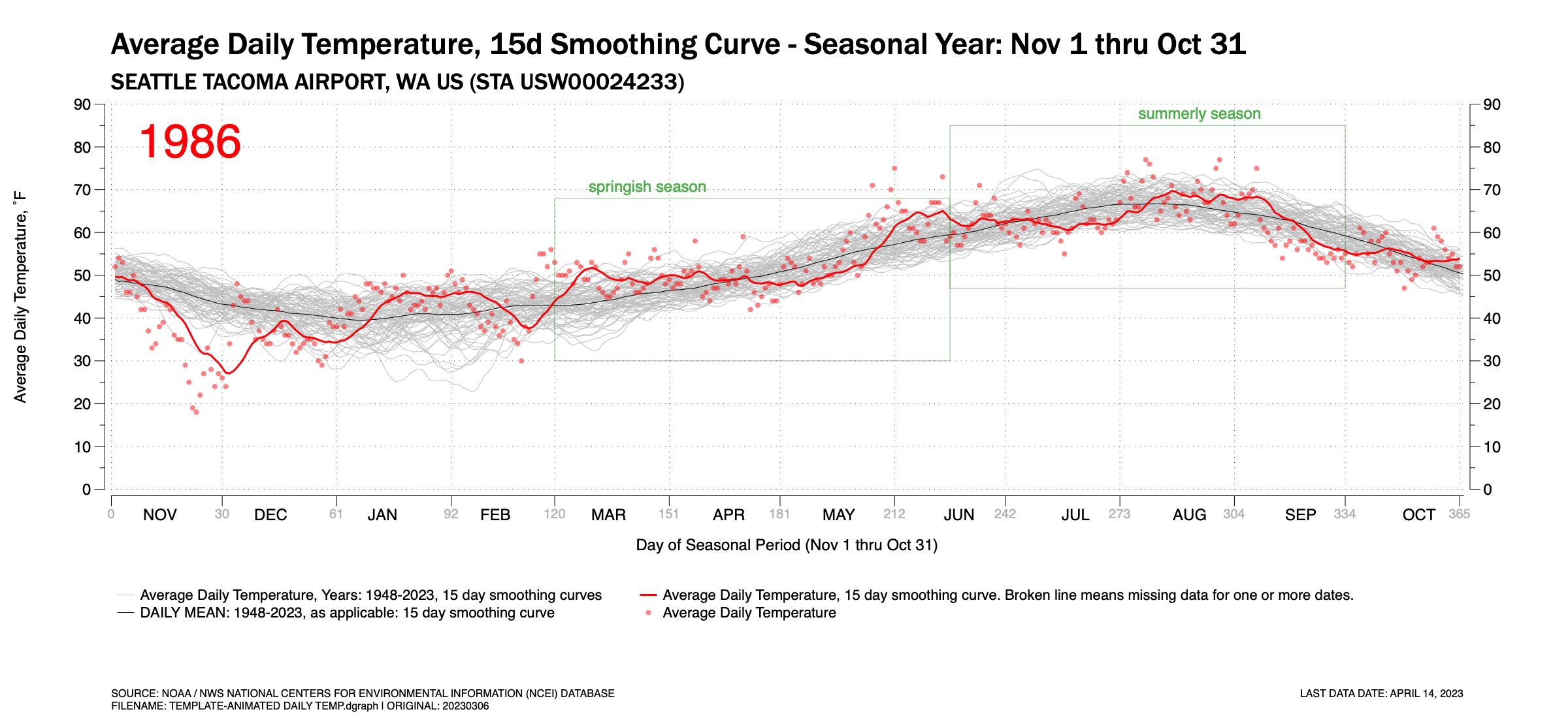
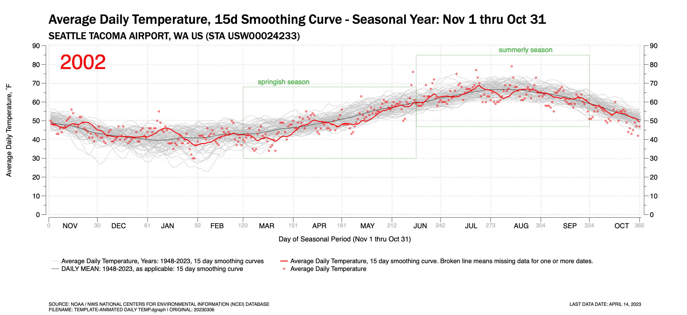
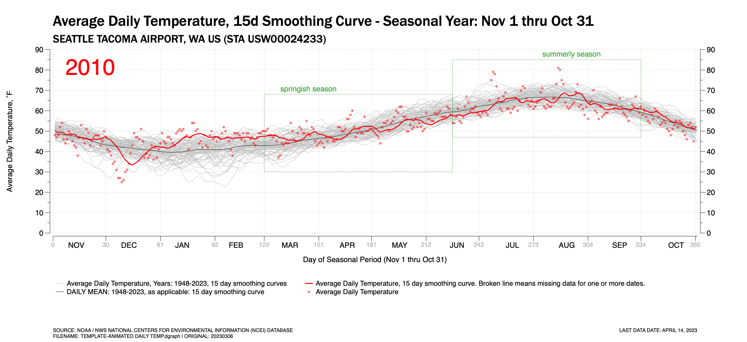
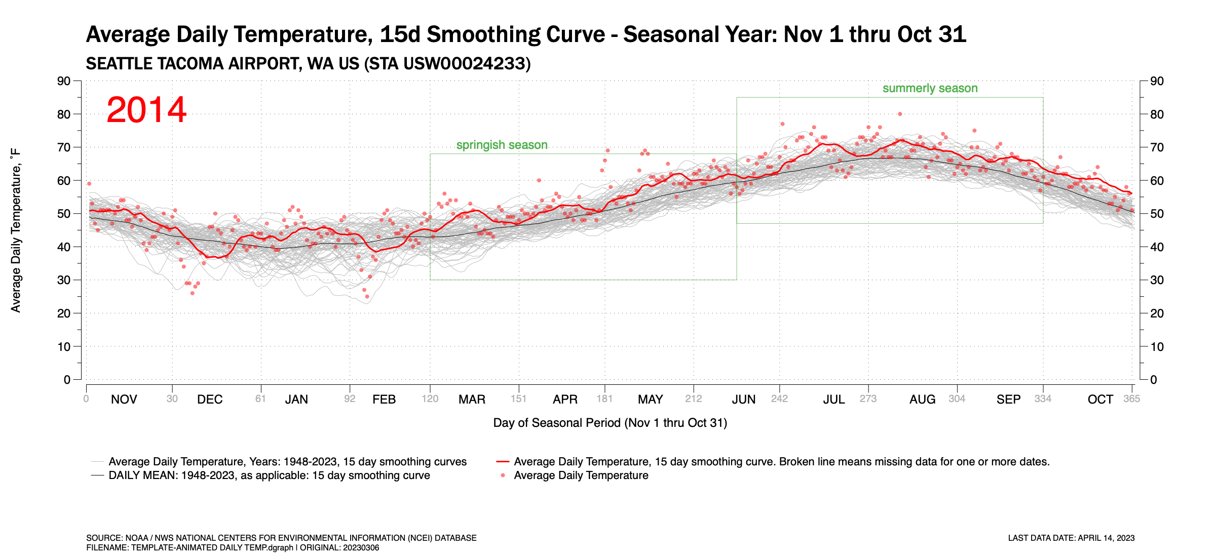
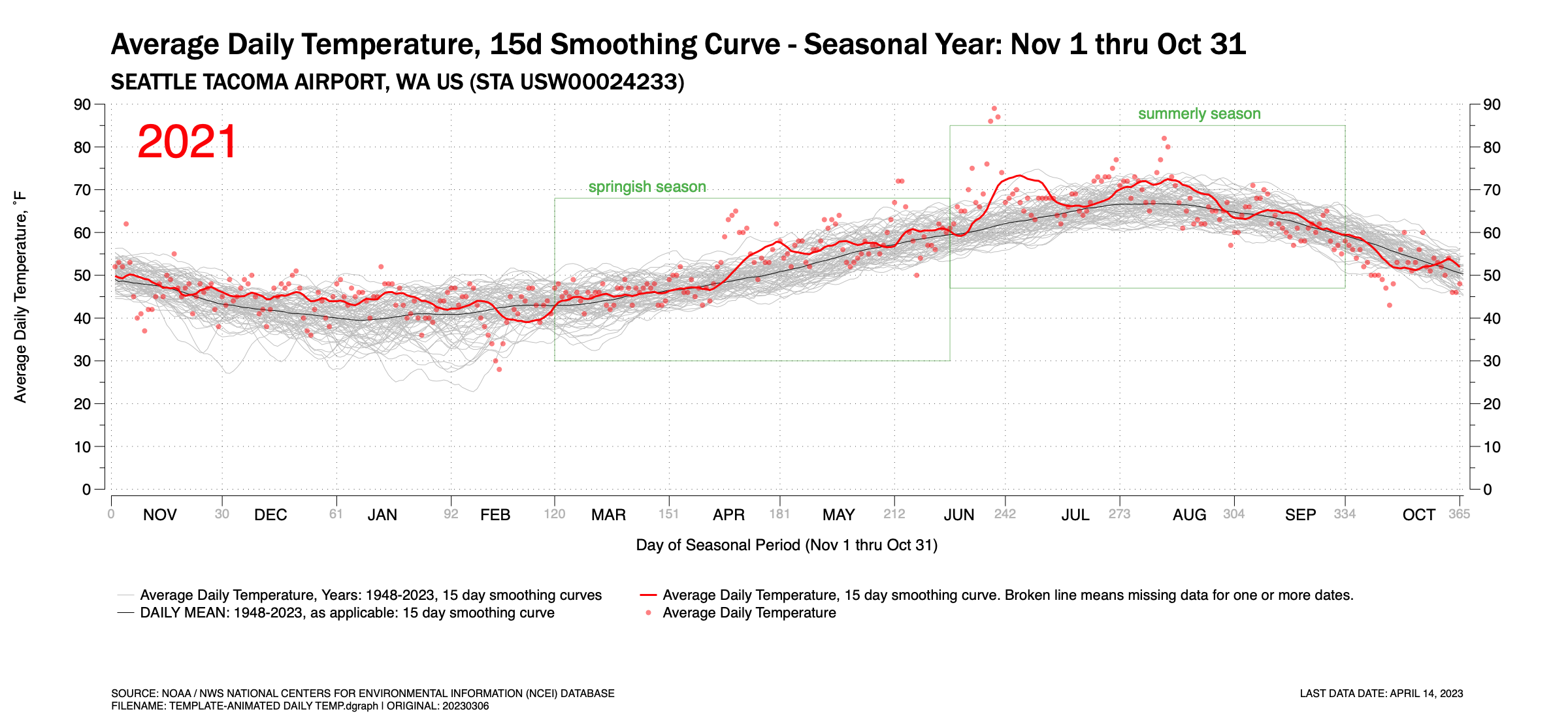
Figure 1 is an animated GIF which pages through the years 1948 through 2023 (to-date) and shows the Average Daily Temperature (ADT) recorded at Seattle Tacoma International Airport. In the background, three basic time-series traces exist: (a) light gray traces of 15-day running averages of the ADT for each year; (b) a red trace showing the  15-day running average of the ADT for the highlighted year; and (c) a dark hairline curve of the 15-day running average for the mean of all years. Individually recorded daily ADTs are show as red points.


The animation highlights the wide year-to-year variability in the ADT as the red highlighted year trace fluctuates across the broader gray traces for each year. Some temporary trends exist though you need to look at them quickly. In the early-mid 1950s, the ADT traces are often in the low half of the temperature band. In the 2010s, the opposite is true. Still, even with this, year-to-year variance fluctuates commonly across the gray temperature traces.


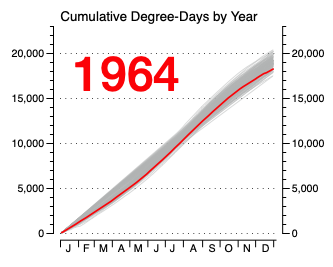
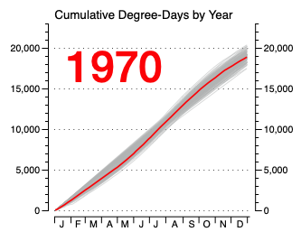
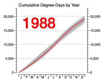
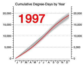
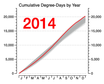
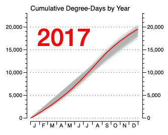
Each highlighted year’s chart is shown in Figure 2. Scroll down to compare. It is easier to compare still images more accurately and studiously. The animation simply shows the wide year-to-year variance.


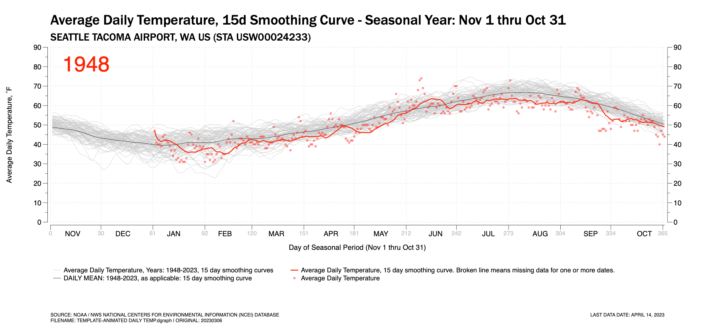
Figure 1. An animated GIF showing the daily Average Temperature at Seattle-Tacoma International Airport for the years 1948 thru April 2023. Also shown is the 15-day running average and the mean daily temperature for all year, also plotted as a 15-day running average.


Figure 2. Time-Series Plots by Year

Click any chart to enlarge. Hint: Once an annual year shows up, you my be able to navigate using your keyboard’s left and right arrow keys

Seattle's (relatively) cool winter, Part 1...

Updated on April 6, 2023


I first published this blog post on March 18. The day before,  it warmed to the 60’s for the first time since October in and around Seattle. This felt very nice to my cold bones. It has been a relatively cool winter this year if you look at the December – February traditional winter period. January was relatively mild, warm, and dry for a winter period in Seattle. But the traditional meteorological winter was bookended by a coolish December and February. Extend the bookends of the period to November and March (to-date), four of the past five months have been cooler than normal.

My charts only contained data through March 15 when I first published the post on March 18. Now, a week into April, I have data through the end of March. The updated figures below reflect this.

I’ve posted several charts below. Figure 1 is an animation. The chart is a series of traces which track the cumulative average daily temperature recorded at Seattle Tacoma International Airport (KSEA) for the seasonal period of November 1 through March 31 for the years 1949 through 2023.

NOTE: The animation is an animated GIF file programmed to loop through twice. Each loop takes roughly 25 seconds. Refresh the browser window (command+R) to restart the animation.

Figure 1. Accumulated daily average temperature traces by seasonal year, 1949-2023, at Seattle Tacoma International Airport.

A few notes about Figure 1 follow:

  1. I’ve chosen a “made-up” metric. I don’t know if this is used by the National Weather Service, meteorologists, or climatologists with any regularity. I call my metric or index the Accumulated Degree-Day (ADD). It simply takes the average daily temperature recorded at KSEA and adds it to the previous days. It is similar to Heating Degree-Days and Cooling Degree-Days which are commonly summed over a period of time but my ADD does not use a threshold temperature of 65˚F to compare against. But it does give one an idea of how cool or warm the seasonal period has been in comparison to similar periods in other years at a common location.  I suppose it’s units would be ˚F-Days.

  2. The gray traces in the background display each year from 1949-2023 for an aggregate comparison.

  3. A blue trace is highlighted for each individual year as the animation is played.

  4. Since each seasonal period plotted crosses two calendar years, I’ve chosen the latter of the two calendar years to identify each individual trace. So, the trace for the November 2022 – March 2023 period is identified as ‘2023.’

  5. The highlighted blue traces extend to March 31 for each year.

  6. An average ADD trace for all years has been added to the chart for comparison. The ADD trace is shown as a black  hairline. For the total November–March season period, the total average ADD value is 6482 ˚F-Days.

  7. Some data went uncollected by the National Weather Service on March 16-17, 2023 at Seattle Tacoma International Airport which made it difficult to calculate a daily Average Daily Temperature for these dates. The missing data is explained in the chart and the days impacted are shown in a red block on the chart.

  8. Finally, I name the animation a dog tail chart because when played back, especially at higher frame rates, these types of charts look a little like a wagging dog tail. 


So why an animation? Animations display motion, and motion display movement over time and, possibly, patterns. You may want to ask yourself; year-to-year is there any rhythm, pattern or trending that becomes obvious that might be difficult to discern when comparing a series of still images or charts. This is especially true when comparing 74 still images if each chart was published separately (and they are further below).

 And there does appear to be some patterns at the distal ends of this period we’re investigating. In the late 40’s and through the mid-1950’s there are a series of coldish winter seasons(7 of 9 between 1949-1957). This is well documented in old photographs of heavy snows in Seattle during this period. And one could argue that the 2010’s have a pattern of warmer than normal winters (6 of 8 between 2014 through 2021). But mostly, this animation shows the high level of variance fluctuating between cooler-normal-warmer winter cycles. The late 2010’s may have shown warmer periods, but this season is quite cooler. And there were warmer winter seasons in the 1950s.

*****

The individual annual temperature traces which make up the animation are shown below. The are shown in order of the earliest year (1949) to the most current (2023). Click on any individual image below to see more detail and to compare.

San Francisco's rainy season...

California is in the midst of a wet and snowy winter. It sounds as if more is due this coming week. Although the copious amounts of rain and snow have wreaked havoc in some places, after several years of drought, this influx of moisture was very much needed.

 Not much in the way of charts to show here on this initial post on California. But I’ll post two charts. The data comes from the National Oceanic and Atmospheric Administration’s (NOAA) National Centers for Environmental Information (NCEI) site where you can download historical climate data records for most major weather stations in the United States.

 The data shown below is for San Francisco International Airport and ranges from July 1, 1945, through the present. I plotted these charts using a water year calendar. The water year calendar is a convention often used when plotting precipitation or snow data because on the West Coast these are typically cyclic or seasonal events. Most precipitation events fall during 4-6 months of the year beginning in October. This is true up and down the coast, though the precipitation season typically longer in higher latitudes. Therefore, the water year calendar typically runs from October 1 through the following September 30 to encapsulate the data for an entire season, which traditionally spans across two standard calendar year-dates. So, for the current water year, data is included from Oct 1, 2022, through September 30, 2023. This span is referred to the 2023 water-year (WY), as nine months of it exist in 2023.

 I disregarded the early data period from July 1, 1945, to September 30, 1945, since it only represents a small part of the 1945 WY.

***

 Figure 1 is called a dot plot and it shows the total accumulation of precipitation for each WY from 1946 to 2023. The current water-year is only partially complete. The data has been sorted showing the rainiest water seasons on top. I’ve highlighted the current 2023 WY in red. I’ve also highlighted the previous nine water seasons in blue. You can see much of the period between 2014 and 2021 were dry years though 2015-16 were close to the mean for total rain. The 2022 and 2019 seasons were also relatively close to the mean for annual precipitation. The 2017 WY, now six years past, was quite wet (for San Francisco). This year is so far close to the mean, but we are only five months into the water-year. But those are the wettest five months.


Figure 2 is a short animation (~30 sec.) which shows a cumulative precipitation trace across the water year of each year from 1946 to 2023 (through March 2, 2023). It can be seen from this chart that year-to-year, (a) the basic pattern is the same (lots of rain early followed by a long dry spell until October, and (b) the total amount of annual rainfall varies widely. And playing the small animation through there doesn’t appear to be a year-to-year trending pattern other than what was mentioned in the previous paragraph.

Helpful hint: Clicking on the gear wheel in the lower playback element allows you to slow or spead the animation playback rate.

Figure 2. Precipitation traces for San Francisco International Airport, 1946-2023 (current). Traces are displayed one at a time and follow the water year calendar starting on October 1 and ending the following September 30. The water year number takes on the year value for the January to September dates.

NYC's Central Park in Snow...

I’ve never been to New York City though I’ve always wanted to visit and even live there. I remember when I told a colleague I worked with in the Seattle area in the mid 90s and who grew up there, he said 

“Dave, it’d eat you alive.”

 I replied, what do you mean? I’ve been around.

 “You haven’t been to New York. It eats up people like you.”

 I protested, People say this all the time. The whole city’s made up of people from other places.

 “Trust me Dave. It’d eat you alive.” End of conversation. He moved on to another task. I laughed.

 …

Anyway, it is probably too late for me to ever live there, but maybe one day I’ll visit New York. And as a daily reader of the New York Times, I sometimes come across a local story which gets me wistful about visiting or living there sometime. And whenever I do that, I think back to that brief 30 second conversation I had underneath a giant 747 being tested prior to rolling out to the flightline for further finishing work.

 And that happened tonight when I came across a story that NYC might get its first meaningful snowfall of 2023, on nearly the last day of February. I’ve always loved photographs of New York in winter. The old black and white ones, but also the color ones – especially the color ones from the late Saul Leiter. It’s hard to imagine New York getting through a winter with little to no snow. But what do I know?

 I decided to look at how much NYC sees in a typical winter. So, I went to the National Oceanic and Atmospheric Administration’s National Centers for Environmental Information (NCEI) data portal to see where data of records were collected for New York City. Sure enough one of those locations was in Central Park with records going back to January 1, 1869. I downloaded the temperature and precipitation data for this location just for grins and looked.

  And it appears, New York City gets quite a bit of snow in Central Park certainly when compared to the city I live in, Seattle.  It looks like on average about 26 inches over the course of a typical winter falls in Central Park, though that varies widely.

 I put together several charts to see if any patterns or trends over time could be detected. Frankly, I don’t see many from this broad (and quick) overview. In fact, I was surprised how uniform the data looked whether years were grouped across decades or individual snow events were plotted across time.

 You can see what I found with this very cursory look tonight in the following five (5) figures. Click on any chart to expand.

Figure 1. Accumulated snowfall in Central Park. Group in 20 year bins or bars. Note that records only began in 1869. The first bar only includes data for 12 years. The most recent 20-year grouping began only three years ago. Therefore the last bar is quite small on this account.

Click on to expand.

Figure 2. Individual snow events grouped by years (e.g. not individual event dates).

Click on to expand.

Figure 3. Individual snow events grouped plotted on event dates.

Click on to expand.

Figure 4. Individual snow events from 2000-2023 and grouped by years (e.g. not individual event dates).

Click on to expand.

Figure 5. Individual snow events from 2001-2023 and plotted on event dates.

Click on to expand.

DATA SOURCE: NOAA NWS NCEI DAT PORTAL, https://www.ncdc.noaa.gov/cdo-web/, accessed 27 Feb 2023. Station Name: Central Park NYC.

Temperature changes at SeaTac...

Weather data collected at Seattle Tacoma International Airport (SeaTac) is generally considered the main data of record for the Seattle metropolitan area, though there are several other sites in the region where meteorologist and climatologists gather their information. Data has been collected at SeaTac continuously since 1948, though some data is missing from the records for the period of October 1, 1996 through October 31, 2005. This missing data is generally the snow and sky cover observations. Temperature, the focus of this page, and precipitation data was collected during this period and is available from the National Oceanic and Atmospheric Administration (NOAA) and their publicly accessible National Centers for Environmental Information (NCEI) Climate Data Online (CDO) tool.

So, having temperature data from 1948 through yesterday (Feb 22, 2023), how much has the average daily temperature changed at SeaTac over the past 75 years (inclusive) if at all? And are there any trends? If so, one would assume that the temperatures have slowly warmed over the years based on all the science and reporting published over the past decade or longer.


An undulating plot

The National Weather Service generally reports the daily minimum temperature (Tmin) and daily maximum temperature (Tmax) at the weather stations. The average of these two values is calculated and recorded as the average daily temperature (Tavg). Often when looking at or downloading past data from a weather station, the user receives only the Tmin and Tmax values for a given date. This is common on older records. Sometimes the data includes the calculated Tavg. Regardless, knowing that Tavg is the average between the Tmin and Tmax values, the Tavg shown in the following charts has either been calculated by the NWS and reported, or this author has performed the calculation in the spreadsheet I’ve imported data from the NWS into.

If you plot the TAVG value for every date from January 1, 1948 through today as shown in Figure 1 you get an undulating or wavy curve form. Obviously, the average daily temperature of a summer day is much higher than the same on a winter day in Seattle. It is difficult to determine if there has been a fall or rise in the average daily temperature and, if so, by how much by just looking at this wave form.

Figure 1. Average daily temperatures trace from 1948 to 2022, Seattle Tacoma International Airport.

I’ve added a linear trend line in red in Figure 2. This trend line shows a modest rise in daily temperatures over the 75-year period. The average daily temperature recorded at Seattle Tacoma Airport has risen from roughly 50˚F to about 54˚F during this period, a rise of roughly 4-4.5 ˚F, or 2.2-2.5 ˚C.

Figure 2. Average daily temperatures trace from 1948 to 2022 with red trendline, Seattle Tacoma International Airport.

Annual Cumulative Degree-Day Index (ACDD)

Another method of looking at temperature changes over time and comparing these to other years over a long period is to plot the cumulative total of daily average temperatures and plot that accumulation over the course of a year. Then plot a similar curve for each year in the period of study. This is shown in Figure 3.

A simple way to check this value is described here. Say the average annual daily temperature at SeaTac is 50˚F. This is the average daily temperature over the course of a year. Some days will be cooler and some warmer. If you multiply (50F DEGREES) X (365 DAYS) you’ll get a value of  18,250 DEGREE-DAYS, or 18,250 DD. I’ll use the term Annual Cumulative Degree Day (ACDD) to indicate the degree-days accumulated over an annual period at a specific weather station.

Looking at the y-scales on Figure 3 shows that summing the average daily temperatures for each day of the year will get you to approximately 18,250 ACDD.

Note: My use of an index I call degree-day is not the equivalent of Heating Degree Days (HDD) or Cooling Degree Day (CDD), both indexes used in the building systems world to calculate required heating or cooling loads for designing heating and air-conditioning equipment and systems and both reported on in daily summary statistics from NOAA/NWS data repositories. But it is similar in the sense of understanding the total amount of heat received over the course of a year (as defined by the sum of the daily average temperatures) in any given year at SeaTac airport. Each gray line or trace shown in Figure 3 represents one year in the 1948-2023 period.

Figure 3. Annual Cumulative Degree Days (ACDD) plots for each year, 1948-2022, Seattle Tacoma International Airport (KSEA).


Comparing individual years

Figure 4 shows ACDD traces of four individual years (highlighted in red) plotted against similar ACDD traces all years. Of the four selected, 1948 and 1985 started off relatively cool through the end of June and then each had a cool autumn and early winter. The plot for 1966 shows it too started cool through spring and into early summer before a late summer surge gave it a relatively average ACDD Index value for the entire year. The plot for 2015 shows the year had an average winter and spring temperature-wise for this region, followed by a warm period extending through the remainder of the year. For the 74 full years between 1948-2022, this year (2015) was the warmest on record in Seattle.

Figure 4. Individual ACDD trace samples for four select years, Seattle Tacoma International Airport.


Small Multiples

Figure 5 is a series of plots grouped as a whole. Each individual plot can be clicked on to expand it. This form of data graphic is collectively called small multiple. It allows one to compare one year to other years easily. It also allows for a deeper dive into any individual year.

Detecting trends requires a little more study, but you can see that, in generally, the ten years from 1948-57 were cooler than average at SeaTac. One can also see that the 10-year period from 2013 through recently completed 2022 have been warmer than average. There was another five-year period running from 2003-07 which were warmer than average. Most of the other years hovered near average, though it is common over any ten year stretch to see back-to-back years running much cooler or warmer than average.

Figure 5. A small-multiples data graphic comparing the Annual Cumulative Degree Days (ACDD) tracing for each of 74 consecutive years at Seattle Tacoma International Airport.

Another interesting thing that shows up when plotting the Degree-Day number for each year is best seen going back to Figure 3. Notice how in the winter and early spring months, Seattle tends toward either warmer or cooler springs. Very few annual periods are “average”. Notice the “gap” that exists between early February through May. This period in the calendar tends towards two groups or strands of tracings which braid together in midsummer. By the end of each calendar period, the tracings have advanced towards split ends.

I don’t know why. I wonder if La Nina years tend towards one strand and El Nino years towards the other. Mathematicians, meteorologists, or atmospheric scientists might understand this “strand” phenomenon or “strand theory” better than I.


An Animated Chart

Finally, Figure 6 is an animated chart. It is an alternative to the small multiples chart shown in Figure 5. It displays each year’s trace above the gray traces of all years sequentially. You can imagine it looking like a dog’s tail wagging. This means of presenting data highlights the year-to-year variability. It also can show trends if over a course of periods of years, the “tail” wags high or lower. You can witness by watching the video the early years of recorded temperatures tend towards cooler days and as time marches forward, the wagging tail inches up the chart. Year-to-year the tail wags randomly (annual variability), but over time a pattern emerges of the tail drifting upwards into warmer cumulative temperatures (periodic trending).

Figure 6. ACDD traces for Seattle Tacoma International Airport, 1948-2023. The animated GIF should loop through once, probably upon initial loading of the web page. Notice that the wagging red line slowly drifts higher as the years progress. Drifting high indicates the total daily temperature load is increasing (e.g. days are getting warmer on average).

HINT: Refresh (Command+R) the web page to cycle the GIF in sequence. And remember to scroll back down to the bottom of the page after refreshing.


That’s all for this post, just some interesting new ways at looking at annual temperature profiles for data from selected NOAA / NWS collection sites. I used SeaTac Airport as an example as I live in Seattle.

1993 vs. 2022

Precipitation data updated on June 30. This is the final update to this post.

The spring and early summer of 1993 was memorably wet for some of us who have called Seattle home for many years. That was the one year where I belonged in a van pool to go to and from work. each day. One dreary morning following a series of similar days in June or July, several people in the van were complaining about the weather. I can’t recall if I was one of them or just in my mind agreeing with that sentiment. I do remember a fellow vanpooler and native of Seattle chastising the complainers and suggesting this weather was normal for Seattle and telling us if we didn’t care for it, we should move. I had mixed feelings but did not completely disagree with her.  Nevertheless, that was my 10th summer in the city, and I hadn’t recalled any of the others being so miserable weatherwise.

We appear to be experiencing a similar wet and cool spring and early summer in 2022. It has brought up memories of that gray early summer of 1993. I was just speaking to a neighbor yesterday about the very thing though she hadn’t lived in Seattle in 1993. What triggered my discussion was looking at the daily rain total from the day before and seeing we had set a record for that June day. The previous record was in place since 1993.

So how does this wet spring and early summer compare to a similar period from 1993? In all honesty, I didn’t know if 1993 was our wettest spring since 1984, my first year in Seattle, let alone for the recorded history of spring weather at Seattle-Tacoma International Airport (KSEA) going back to the 1940s. But it was, for me, a memorable wet period, as is this spring, so let’s compare.

*****


Precipitation

Figure 1 shows the cumulative precipitation traces for calendar periods starting on October 1 of one year through September 30 of the following year recorded at SeaTac airport. This period is often considered the water year on the U.S. west coast due to our seasonal weather patterns of a strong wet season usually followed by a strong dry season. The midpoint of this multi-calendar year span is April 1 which roughly represents the transition period from wet-to-dry seasons.


Click to enlarge.

Figure 1. Cumulative precipitation traces for water years 1948-49 through 2021-22 at Seatlle-Tacoma International Airport (KSEA).


I’ve highlighted two specific annual traces: the 1992-93 and the 2021-22 water years. The first obvious thing one notices is that since October 1 of last year, this has been one of Seattle’s wettest periods. It is in the top five wettest water years so far. Ironically, two of the other 74 traces in the top five category are also recent water years, 2015-16 (#3) and 2016-17 (#1).

A second obvious feature is that in the first six months of water years 1992-93 and 2021-22 leading up to April, it has been far wetter this water year (2021-22) than 1992-93. On April 1, SeaTac Airport had already seen 35.8 inches of rain during the previous six months. On April 1, 1993, SeaTac Airport had seen 21.35 inches of rain in the previous six months. This is a difference of 14.45 inches, or more than two average November’s worth of rain. Memory plays tricks on us, but I’d argue that up to June 10, this water year has been much drearier than 1993.

There are two boxes on Figure 1. These boxes encapsulate the period between April1 – June 10 for each trace being compared, 1993 (red) and 2022 (blue). The total amount of precipitation for each period is similar, 8.94 inches and 8.83 inches respectively. The typical Seattle summer dry spell in 1993 began on or around July 30. It remains to be seen when this will occur in 2022.


Figure 2 shows the same data as Figure 1, cumulative precipitation at SeaTac for the years 1948-2022 except the it shows precipitation for the months of April through August. The values have been zeroed to March 31 for comparison purposes. Plotting this shows just how wet this spring has been. Aside from 1948, 1993 and 2022 have been two of the wettest springs recorded at SeaTac Airport. The spring of 1993 ended up being the second wettest spring recorded to-date at SeaTac. The spring of 2022 ended up being the fifth wettest.

Click to enlarge.

Figure 2. Cumulative precipitation since April 1 at Seattle-Tacoma International Airport (KSEA) for the years 1948 through 2022.


Figure 3 is a dot plot which ranks the precipitation periods from April 1 to Jun 17 and is analogous to Figure 2 showing the values for all traces between 1948 to 2022. In mid-June, the springs of 1993 and 2022 were virtually tied for 2nd place. But the latter half of June 2022 was relatively dry and the final tallly of April-June precipitation for 2022 dropped the year to fifth place on Figure 3. June 1993 ended up having .68” inches more of precipitation than June 2022.

Five of the top ten wettest years for this April-Jun period have occurred since 2010. At mid-month it was six. The 2017 period dropped to #12 on the list by the end of the month.

Figure 3. Ranking of spring-summer precipitation at Seattle-Tacoma International Airport (KSEA).


Figure 4 shows the same data displayed in Figure 3 but lays the data out in chronological order to see if any trends over time are evident. Any trending appears to be mild, but there appears to be a slight increase in spring and early summer precipitation in recent years.

Click to enlarge.

Figure 4. Cumulative spring-summer precipitation trends, April 1 through June 30, KSEA.


Temperatures

This spring has been much cooler than normal since April. How do the temperatures of Spring 2022 compare to Spring 1993?

Taking a look back at April through June daily average temperature departures from normal (30Y average for 1961-90) shows that spring and early summer was normal to slightly warmer than normal. The average April daily temperature was about 1˚F warmer than 30Y normals. The average May daily temperature was about 4˚F warmer than long-term normals. And the average June daily temperature was just about normal.

Contrast this with this spring and early summer (to-date). This year at SeaTac airport, the average daily temperature in April was -4˚F, the average May daily temperature was -4.6˚F, and the average June daily temperature (to June 17) is -2.4˚F. These are averages across an entire month. Of course there were nice days during these periods, even some warm one, but in general it has been a very cool spring and early summer. These differences are shown in Table 1.

Table 1. Monthly Average Temperature Deviation from 30-Year Normals


Figure 5 shows the daily temperature departures for the period from April 1 to June 30 for 1993. A 7-day average line plot is included.

Figure 6 shows the same data for this year through the most recent data point.

Click to enlarge.

Figure 5. Daily temperature departures for April through June 30, 1993.


Click to enlarge.

Figure 6. Daily temperature departures for April through June 18, 2022.

Looking back, spring and early summer of both 1993 and 2022 were wet and gloomy. Some people like the rain and clouds. Come spring and summer I’m ready for light, increased sun, sunrises and sunsets, and warmer temperatures to separate from our normal 6 month wet and cool winterspring climate.

But this spring and early summer has been much cooler than those of 1993. However, the current spring / early summer did get a boost of warmth in the last two weeks of June.

It’s also been notably darker in terms of solar radiation compared to recent years (I don’t have similar data for 1993).

Based on this, barring any sudden change in weather for the last two weeks of June, I’d have to say this year takes the cake for weather gloominess.


on balance...

The Pacific Northwest experienced an extraordinary heat wave last summer. The heart of the heat wave lasted three days; however the days leading up to and trailing those three core days were also very warm. The average daily temperatures at Seattle-Tacoma International Airport (KSEA) for June 26-28, 2021 exceeded normal daily temperatures by 22˚F, 25˚F and 23˚F respectively for those three hottest days. The actual daily maximum temperatures for this period were 102˚F, 104˚F and 108˚F. This event was covered prominently in local, national and international news and continued to be for months afterwards.

However, in the Seattle area (just a relatively small area impacted by the heat wave), aside from another relatively hot period towards the end of July, the rest of summer was very pleasant. In fact, by mid-August, mean daily temperatures began to fall short of normal August temperatures. September and October, often pleasant and warm months in the Seattle area, were both cloudier and cooler than normal. And aside from a warmish period in late November 2021 when atmospheric rivers from the tropics swept in warm winds and huge rainfalls causing massive flooding in parts of the Pacific Northwest and British Columbia, the past winter and spring has continued to be rather cool and showery.

It has been 317 days since the heat wave broke. I plotted the average daily temperature departures from 30Y-normal mean daily temperatures at SeaTac (KSEA) for these 317 days. I also included the 317 days prior to the heat wave as well in the plot. Including the 3-day heatwave, a total of 637 days are plotted in Figure 1.

Click to enlarge.

Figure 1. Daily departure from normal temperature trends, August 13, 2020 through May 11, 2022.


The temperature trends in Figure 1 appear to show a certain seesaw symmetry around the brief heat wave. The linear fit curve (for just the shown data range) crosses the X-axis about a month after the heat wave broke. The pre-heatwave period had 183 warmer-than-normal days at an average of about 4.8˚F warmer per day. The post-heatwave period had 183 cooler-than-normal days. at an average of roughly 4.3˚F cooler per day. One key difference is that the pre-heatwave period had almost twice the number of neutral days than the post-heatwave period.

I suspect this symmetry is likely more coincidental than anything else and likely had little to do with the large heat dome that set in place last summer and caused temperatures to peak. It likely has much more to do with the strong La Nina pattern we’ve been in this winter and spring. Atmospheric systems are huge and are likely slow to change. Though 637 days sounds like a lot of data points, it’s less than two years and it’s perfectly normal for warm and cool trends to settle in for long periods. But just looking at the chart and thinking in medical terms, it appears the “fever broke” after the extraordinary heat wave.

The truth is, if you look at the longer record and extend this chart backwards for many years as shown in Figure 2 the cooling trend appears much more moderate. This chart goes back to 2000. And a 365-day smoothing curve of average daily temperature departures shows a much more gradual cooling trend (after an extended warming trend reaching back to at least early 2017).

Click to enlarge.

Figure 2. Daily temperature trends, Seattle-Tacoma International Airport, 2000-2022.

A dark start to winter...

Updated: December 29, 2021, 6:30 AM PDT

Figure 1 updated with most recent data.
Figure 2 has been updated. Note that the minimal value on the x-axis begins at 320 MJ/sq.meter. Figure 3 has been updated. Note that the minimal value on the y-axis begins at 300 MJ/sq.meter. Figure 4 has been added to show the daily temperature departure for 2021 to date.
Figure 5 has been added to show the daily temperature departures since 2000 at SeaTac airport.


If it seems like it has been pretty dark and rainy this autumn and early winter in Seattle you would be right. I’ve already posted about the high level of precipitation we’ve seen in Seattle and the extended Western Washington area since the start of the 2021-22 water year on October 1. The areas surrounding Bellingham and Vancouver B.C. have been especially hit hard with rain.

But it has seemed very dark in recent months as well, and by dark, I mean low levels of light. Of course all this rain comes in leaden skies. And looking at solar radiation data collected near Husky Stadium and Union Bay (47.66, 122.29) in Seattle confirms this has been the darkest start to winter in the past ten. Washington State University operates a solar collection station in this area and exposes the processed data to the public on their web site. A link to this data is listed at the bottom of this page.

Figure 1 shows the cumulative daily totals of solar radiation (MJ/sq.meter) from October 1 through December 31 for 2013 through the present year. At this writing we are only partly through December this year. But it is clear that this year has been quite dark compared to the other years. Lower traces indicate lower levels of solar energy measured. This year’s trend line is the heavy line. The Seattle area began with a normal October, but around mid-month the rate of cumulative solar energy slowed considerably.

I choose a start date of October 1 since this is the traditional start date of the Northwest water year, the time of year when storms begin to blow off the Pacific with increasing frequency. This date provides a good start or “zero point” for the start of the wet season.

Figure 1. Solar radiation measured at Seattle’s Union Bay data collection site.


Figure 2 was added on December 15. This figure is a dot plot showing the total cumulative solar radiation received at WSU’s Solar Station in Seattle. The dot plot is sorted by total solar daily accumulation for the stated period.

This year’s accumulation of sunlight since the start of October is marked by the black dot in the lower left corner. It is substantially lower than the sunnier years at winter’s start. It is substantially lower than the median value for all years shown. The median value is shown by the dash vertical line.

Looking at the years’ positions on the y-axis, there does not appear to be any pattern to the order for the very limited number of years for which data exists.

Figure 2. Dot plot showing cumulative solar radiation sorted by year.


Figure 3 essentially shows the same data as Figure 2. In this bar chart, the years are in order along the X-axis (horizontal). It’s a little easier for the mind to see the lack of any pattern by time in this small sample size – we are more often used to seeing date-format data along the horizontal axis, increasing in time from left-to-right. It’s also clear to see how low sun levels have been this Oct-Dec period compared to recent years. All years show data through the date in the title.

Figure 3. Cumulative Solar Radiation, Oct 1 through December, sorted by years, 2012-21.


In addition to lower solar radiation levels in Seattle since roughly mid-October, it has been a relatively cool autumn and start to winter. September had mare days that were cooler than normal than days warmer than normal. Same for October. November was pretty mild with a series of atmospheric rivers coming in from the tropics. Those brought warmish, moist air with them. And plenty of flooding in parts of the Pacific Northwest and southern British Columbia. December has been relatively colder than most recent Decembers. This can be seen in the large number of days where average daily temperatures have been below 30Y climatic normals.

Figure 4 shows the daily temperature departures for 2021 up through the most recent date.

Figure 4. Daily Average Temperature: Departure from 30Y normals. Click to enlarge.

Figure 5 shows similar data as Figure 4, daily average temperature departures from 30-year normals going back to January 1, 2000. It appears in recent years, the trend is back towards the climatic normals of the past 30 years after a warming period for several years in the mid-2020s.

The 30Y normal daily average temperature reference values for all years except 2021 are based on the years 1981-2010. In 2021, the comparison is against the normal daily temperature range from 1991-2020. It’s possible that the 1991-2020 30Y normals cycles have increased from the previous 1981-2010 30Y cycle and this year’s lower trend is simply reflecting that change - departures may be comparing against a high reference line..

This data is for the National Weather Services’s Seattle-Tacoma International Airport site.

Figure 5. Daily normal temperature departures for SeaTac airport from 2000 to present. Click to enlarge.


SOURCE DATA
Washington State University AgWeatherNet: http://weather.wsu.edu
NOAA/NWS Climate Data Seattle/Tacoma https://www.weather.gov/wrh/climate?wfo=sew
FULL DISCLOSURE
I am not a meteorologist, climate scientist, data scientist, geologist nor hydrologist. I am simply a (retired) engineer who has some familiarity with numbers, basic statistics and probability statistics who enjoys looking at readily available public data and trying to make sense of things. I enjoy building data visualizations from data I find much like others enjoy working daily crosswords or sudoku puzzles. Local weather, climate and hydrology science are complex subjects. Take what you read and find here with this in context.
 

An especially dark and dreary winter...

This has been an extraordinary dark and dreary winter in Seattle. A dotplot of the cumulative daily Sky Cover scores for SeaTac International Airport shows the period between December 1, 2019 though January 29, 2020 far exceeds the scores for similar periods back to 2006-07.


Another way to view the darkness this winter is to look at the average daily solar radiation, measured in MJ/m^2. This data is available from Washington State University.

Extracting data from their ‘Seattle’ location – which I beleive is on the campus of the University of Washington, but subject to correction – you can see that the average daily solar radiation for this winter (December 2019-January 2020) is the lowest value for the past nine years, years in which data is available for this location.


Click to enlarge…


Finally, look at the rain pattern over this same December-January period this water year (a water year calendar runs from Oct 1 thru Sep 30 due to rain patterns in the Pacific Northwest). The line chart below shows that as of January 29, SeaTac International Airport has accumulated almost the exact normal amount of precipitation to be expected based on the 30-year average for this location (established from records for the 1981-2010 period).

But this year, the first 2-½ months of the water year were relatively dry. It wasn’t until about mid-December when the rains began catching up to the 30-year average. It’s taken a lot of steady dark, water-heavy clouds to drop this amount of rain in a relatively short period. This information supports the high level of daily cloudiness and low level of solar radiation shown in the first two charts.

Click to enlarge.

A winter to forget...

The past year (and then some)

This is my final post on this cold snap / winter topic. First, I think the weather is changing and winter really is exiting. Second, as a subject, it has become a little tired. So, here goes. 

I suspect the extended coolish pattern we’ve experienced over the past three months has finally had its run. I’m not a meteorologist nor a climate scientist. Just someone working on my writing and data presentation skills. It just seems that we’re approaching the end of a pattern. The longer term forecasts seem to point towards more normal temperatures.

No doubt, we will still get cooler-than-normal days. Just as we’ll get warmer-than-normal days. But I think the persistent patterns are breaking down. Looking at those cooler-than-normal patterns on the right of Figure 1 shows that up until about March 9, we were still seeing strings of continuous cool days. However, the last few days have been mild, and the temperature deficits have been shrinking since about early January.

A couple of things seem clear from Figure 1

  • This coldish spell was persistent and long — almost 3-½ months long (with a few brief interruptions);
  • it was preceded by at least 11 months of predominantly warmer-than-normal weather; and
  • the change from one state to the other was quite abrupt in early December. It was as though a switch was flipped.

Figure 1. Temperature departures for the past 15 months. Click to enlarge.

****

Temperature Deviations - A longer comparison (2000-2017)

Figure 2 shows similar temperature deviation data to Figure 1, except it covers a much longer stretch of time backwards. The red zones depict the approximate stretch of winter (Dec-Feb) for each annual period.

I mentioned in the section above that prior to the recent three month cold snap, Seattle experienced 11 months of warmer-than-normal temperatures. Well, looking at a longer timescale backwards, the stretch of warmer weather goes back at least about three years, aside from occasional brief spikes of temperatures in the opposite direction.

For most of this period, specifically the dozen or so years extending from 2000 through 2012, the daily differences from normal temp appear to be more evenly distributed between short warmer and cooler periods. The year 2011 appears to have a long stretch of cooler temperatures — more in the early spring-to-fall time frame rather than winter. And the two year period of 2003-04 appeared warmer than normal in winter as well. I recall during this time thinking to myself that after 20 years, I was finally becoming accustomed to cool, rainy Northwest winters and they weren’t as bad as they previously seemed to me. It turns out, I may had just been experiencing a milder series of back-to-back winters.

Figure 2. Comparison of temperature deviations over time (2000-2017). Click to enlarge.

****

What about the rain

The temperature discussion above focuses on the traditional winter months of December through February. In Seattle, our average winter day temperatures don’t differ much than late fall or early spring temperatures. We have mild winters, mostly and coolish springs. In fact, I’ve always considered the period between mid-October to mid-April as one long winterspring season. This time period nearly coincides with the first half of the west coast meteorological water year which typically runs from October 1 to September 30 each year. Seattle, and much of the northern West Coast has a wet season and a dry season. So I’ll use the Oct-Sep water year as a time period to discuss this winter in terms of precipitation.

Figure 3 shows the accumulated precipitation since the beginning of the water year. This year’s line is the blue dashed line. The orange line represents the climatic averages from the years 1981-2010 from SeaTac International Airport. Clearly, we are experiencing a very wet rainy season. So far — and the rainy season for this year is not over  — we have had about 11 more inches of rain than normal since October 1 of last year.

Figure 3. Cumulative precipitation since October 1, present year and historical. Click to enlarge.

So we're having an extraordinarily wet year. Big deal — some years are wet; some are dry. However, are these wet years becoming more frequent? I don't know if we have enough data to establish this claim for the long run, but recent years seem to be.

Figure 4 shows more recent years in the same chart as Figure 3. Last year, the 2015-16 water year, is the heavy black line. Last year was also an exceptionally moist year, the wettest of the previous 14 years shown. The medium gray lines reflect the water years: 2014-15; 2013-14; 2012-13 and 2011-12, the years precluded from the 1981-2010 average. The light grey lines represent the nine preceding years before 2011-12 since I have the data handy and they give some balance to the discussion.

The chart in Figure 4 illustrates:

  • Though it has been very wet since October and we are approach last year’s surge of rain, it is unlikely we will catch it. We are currently about 5 inches behind and are slowly approaching our drier months. Back-to-back years of this flow of water lends understanding as to why many are griping about this winter;
  • This year’s totals are in a tight race for second place of the wettest years of the past 15 years. Today, we are about even with 2006-07, which produced a notably wet start to winter [1];
  • Of the six (6) years since the 1981-2010 climate reference period, three are near the reference average and three are well above it (assuming the 2016/17 water year keeps accumulating precipitation at even the climatic average rate). Simply put, in an annual accounting of rain, we have been in a pretty wet period since 2010.

Figure 4. Cumulative precipitation based on the water year calendar, multi-years. Click to enlarge

So, what happens if you take the averages of the most recent past six water years, not included in the climatic data range, and compare them to the historical averages. Keep in mind that the 2016/17 water year is not even half way completed. This is shown in Figure 5. There has been a significant bump in the amount of precipitation we've seen recently. From the chart, it appears most of this bump has occurred in the months of October, February and March. September also shows an uptick in precipitation as well, but not as pronounced as those three. One could also make the case that summers are slightly drier (seen by the flattening of the blue curve in comparison to the orange one for these months).

Figure 5. Comparing the past six years to the climatic average. Click to enlarge.


Seattle has received over 246 inches of rain since October 1, 2011. Climatically, Seattle would be projected to receives about 214 inches of rain during this period. We've received nearly 34 inches of additional rain in the past six years. Table 1 illustrates this clearly.

This is almost an entire year's worth of additional rain squeezed in those six years. Much of that additional precipitation has occurred in the past two years.

Actually, it is worse than that. I included 2011-12 in Table 1 since it is not included in the 1981-2010 historical averages. I wanted to include all recent years not included in the historical average in an exploration to see where the data took me. 

Since Table 1 shows the 2011-12 water year to match essentially the historical average for the period, you can leave that year out of the discussion. Our near additional year of rain has been squeezed into the past five years. And — again — this water year is not half over yet.

In this context, one may like the rain but should also understand the weariness people are experiencing and the accompanying complaints.

****

Shades of gray

Aside from rain, the most common characteristic of Seattle winters (and wintersprings) is the near constant cloud cover. So, how did we stack up with regards to cloud cover? I’ll use the first half period of the water year for the time scale, since this is traditionally when the clouds roll in.

We began the water year with one of our rainiest Octobers. This was followed by a normal November, typically our rainiest month. So that in itself a sign that it might be shaping up for a pretty dismal winter. However, if you look at Figure 3, the rains softened in December. This can be seen by looking at the slope of the blue curve in December. Further, the last half of January saw little rain. In fact, December and January were cold, but not too rainy. If the skies were not completely clear, we experienced some sun during those months. More than usual, I’m guessing, without looking deep into the data. 

The rains returned in February at an accelerated rate. February 2017 was one of our wettest Februarys. The month of March, to date, has been dismal as well.

The National Weather Service gives a rating for sky cover for each day based on an 11-point scale, going from 0-10. In maybe an oversimplification, a day rated 0 is clear with no clouds. A day rating of 10 has 100% cloud cover. We can sum the scores for each day since October to see how this year compares to other years.

Figure 6 shows this. So far, this water year has been cloudier than all of the previous 10 annual periods except for one. But, with this chart it doesn't appear to be much.

Figure 6. Seattle Cumulative Sky Cover ratings, 2016-17 water year. Click to enlarge.

Figure 7 illustrates this method of comparison with a close-up of the data shown in Figure 4. So far, through March 10, SeaTac Airport has accumulated about 50 more sky cover points than the average for previous 10 years. These additional sky points don't buy you an upgrade; only a slight downgrade, unless you love clouds.

However, spread evenly, 50 sky points divide by 161 days (Oct 1 to Mar 10) account for only about .3 sky points per day. Or, another way of thinking things, the maximum sky cover points any day can have is 10. Divide 50 sky points by 10 points per really cloudy day and we have had roughly 5 extra really cloudy days more than average during this time period.

Figure 7. Cumulative Sky Cover rating points for annual periods running from October 1 through September 30. Click to enlarge.

A simpler way of observing the cloudiness of the past 5-½ months is to look at the total number of cloudy days in a table and compare this year’s numbers to past years. Table 2 shows  this comparison. 

To date, Seattle had about a 68% chance of seeing an all cloudy day this past wet season. Normally, in recent years, this would be a 64% chance. This winter, Seattle also had about an 8% chance of seeing a pretty clear day. In the recent past, we would have a 12.5% chance of seeing a reasonably clear day. The chances of a partly cloudy day are essentially the same for this year and the recent past.

So, yeah. It’s been a bit cloudier than normal; though not that much more. Still, every little bit adds up.


****

Final thoughts...

Yeah, this winter in the Pacific Northwest has been pretty dismal. More dismal than normal. More dismal than most. The coldish streak was a bit long — I grew very weary of it. But the low temperatures were not that cold. Consider the Midwest or Northeast in any normal winter. Our coolish winter temperatures this year were still pretty moderate in comparison.

We had snow a couple of times. Deep enough for some fun and some nice photos. Not too much to cause trouble for commuting in the lowlands, though the mountain passes got hit hard at times.

This area doesn’t seem to suffer too often from daily extreme temperatures, humidities, or even heavy rains. We get strong winds blown in off the North Pacific occasionally, but we don’t see hurricanes or tornados often. 

Where we see extremes, it seems to me, is that we settle into long, long patterns, whether long heat streaks; long coldish streaks, long rainy streaks, and — for me the most dreaded — endless cloudy stretches. 

This winter combined most of those long streaks. I’m happy to see it ending and am looking forward to longer days, brighter skies and warmer temperatures. 

****

References:
[1] City That Takes Rain in Stride Puts on Hip Boots; Yardley, Wm.; New York Times; November 27, 2006.
[2] Data Sources NOAA NWS Seattle Local Climate site (click on text for link).

Charts and Graphics Notes:
Data from NOAA/NWS Climate site was post-processed in Microsoft Excel for Mac 2016.

Figures 1-7 were produced using DataGraph 4.2.1 software from Visual Data Tools, Inc. and available on the Apple App Store. A terrific product that keeps improving — support good engineering and design.

Base charts were copied to Adobe Illustrator CS6 for post process refinement and scaling.

Tables 1 and 2 were developed in Adobe InDesign CS6.


The cold return...

In mid-February there was some small hope that we’d break out of this coldish streak we’ve encountered in Seattle since early December. It turns out this was wishful thinking. There were maybe a week’s worth of slightly warmer-than-normal days to enjoy, but these were accompanied with some heavy rains as well. For a week now, we’ve flipped back to a cooler-than-normal situation. The long-term forecast is much of the same continuing through March. It’s not really that cold; it’s above freezing. But I think a lot of us are looking forward to some more springlike temperatures. I’m pretty sure the plants are.

Daily departures from 30-year normals.
Click to enlarge.

As I mentioned, we had some heavy rains the first half of February. These nearly matched the heavy rains of last October, before we hit a relatively normal-to-dry period from November through January. For a brief period, it appeared we might catch up with last year’s very wet winter. But the rains seem to have taken a pause now that the cold weather has returned.

Onto March…

Click to enlarge.

A warm, wet storm arrives. Is this a turn towards spring?

Early this morning, about 3:30 A.M. a pounding, wet rainstorm woke me up. I sleep beneath a skylight, and though it has yet to leak on me in 17 years, I suspect one day it will. It is in a skylight’s nature to do so. This squall came after an all day rainy Wednesday.

The seasonal water year begins on October 1 in Seattle and runs through the next September 30 for any given period. This year’s water year began exceptionally wet starting about mid-October. Storm after wet storm blew in. But in December — a normally wet month — we seemed to get a reprieve. January was similar except for perhaps a few rainy, individual days.

February seems to have picked up where October left off. We started with snow, but it’s been the strong storms the past few weeks which have really added to the precipitation totals. 

They say more is on the way later this weekend. If true, we may catch up with last year’s very wet winter. But, even with these heavy rains, that would be a tall order.


Cumulative Precipitation for Several Seattle Water Years. Seattle is known for rain. But mostly our rains come in the winter half of the year. Therefore, a local meteorological measure of time is the water year, which runs in our region from Oct 1 through Sep 30. The chart above tracks the cumulative amount of this year's water precipitation (blue, dashed line).

The most recent five water year tracks are illustrated in black, with last year's water year track in shown as the heavy black line. The remaining gray tracks are water years for the 2002-03 through 2011-12 seasons.

Click to enlarge.


****

The recent rains have been warm. This is shown on the far right end of the chart below. Spring often hits Seattle in late February, with our relatively mild Pacific climate. Maybe the cold snap we recently experienced (highlighted on the chart) is over for good and we’re moving into spring. The daylight sure is stronger and richer.

I hope this is true, but it's too early to tell.


Daily Temperature Departures from 30-year (1981-2010) Averages. A significant change occurred in the early part of December where a lengthy, relative warm year switched to a cold period for about two months.

Click to enlarge.

Continued cold...

Our coldish winter in the Pacific Northwest continues. About halfway through winter, cooler days than normal days are the dominant pattern. Here in Seattle we received about four inches of snow on Monday. It's not a large amount, even for here, but it is the first significant snowfall we've had in five years.

Starting a few days into December, the mean daily temperatures switched abruptly from warmer than normal for most of 2016 to cooler than normal. Aside from a few days, it has remained consistently cool.

Click on to enlarge.

A wintry white scene in Seattle's Volunteer Park on February 6, 2017.